
10 High-Converting Facebook Ads (and Why They Work)

Great Facebook ads don’t happen by accident. They follow structure. The best ads trigger emotion, guide the eye, and speak to what people actually want. In this post, you’ll see 10 Facebook ads that convert. Each one breaks down why it works, from how it grabs attention to how it drives action. Clear creative. Clean copy. Real results.
Example 1: My Way Up – Authority First, Education Forward
Why I included this example:
I find this ad fascinating because it reframes creatine from a gym supplement into a women’s health and longevity essential. It combines expert credibility with clean, minimal design, making the science feel approachable yet aspirational.
%202%20(1).png)
The ad leans into authority-first messaging, positioning the product as the most researched, trustworthy supplement in its category. The layered news headlines guide the viewer from credibility to curiosity, ending with a clear visual link to the product itself.
Tactics to Steal
Lead with authority: Start with a strong, declarative headline (“The #1 researched longevity supplement”) to establish instant credibility.
Reframe the category: Take a familiar product (creatine) and present it through a new, science-backed lens (longevity and women’s wellness).
Stack expert validation: Use multiple third-party headlines or studies to signal depth of research and social proof.
Simplify the visual: A neutral background, clean typography, and hand-held jar make the message feel real and trustworthy.
Optimise for feed readability: Clear spacing and large text ensure key claims stay legible across Reels and static placements.
Example 2: Happy Mammoth – The Quiz
Why I included this example:
I love how it turns a personal story into an entry point for discovery. It captures a powerful emotional job to be done: wanting answers after years of feeling unheard. The ad makes that transformation feel achievable through a single, simple step, taking the quiz.
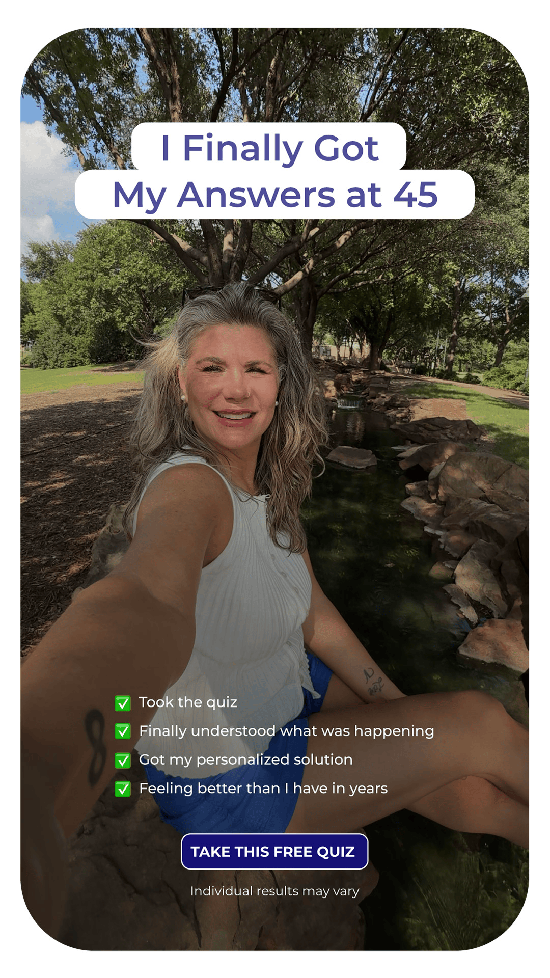
The ad leans into authentic, first-person storytelling, positioning the brand as a supportive guide rather than a sales pitch. The outdoor setting and natural selfie make it feel calm and trustworthy, while the checklist format turns the experience into a clear, satisfying journey.
Tactics to Steal
Lead with transformation: A first-person headline (“I Finally Got My Answers at 45”) instantly builds connection and intrigue.
Build trust through authenticity: A real, unfiltered selfie breaks through the noise and feels emotionally genuine.
Show progress, not promises: The checklist format makes the journey feel specific and real, with each line showing a clear step toward improvement.
Keep design simple: A clean layout and minimal text ensure readability and focus on the person, not the brand.
Guide the next step: A bold, central CTA (“Take this free quiz”) provides a low-commitment, high-reward action that keeps momentum.
Example 4: Heights – Turning Doubt into Proof
Why I included this example:
I find this ad clever because it turns skepticism into confidence. It blends humor with authority, transforming a potential negative into a display of brand strength. Instead of dismissing doubt, it reframes it with calm composure and self-assurance.
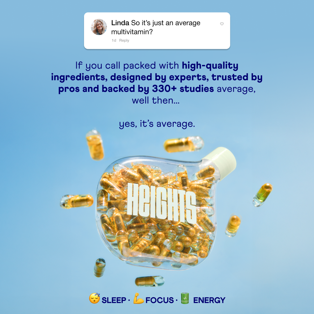
The ad leans into social proof through tone, not testimonials. The casual reply format makes it feel conversational and authentic, while the bold design and research-backed copy communicate credibility. The visual of the capsule-filled bottle reinforces the product’s tangible value and science-first identity.
Tactics to Steal
Flip objections into storytelling: Use real or simulated customer comments to introduce a playful, confident response.
Mix humor with proof: Balance wit (“yes, it’s average”) with credibility (“backed by 330+ studies”) to humanize a science-heavy message.
Lead with authority: Highlight expertise, research, and design to elevate the product beyond the generic category.
Anchor visuals in product trust: The clear capsule bottle and floating pills create a sense of transparency and quality.
End with benefits, not features: Emoji-based microcopy (“Sleep • Focus • Energy”) turns complex benefits into quick, visual takeaways perfect for scroll-stopping ads.
Example 5: OSHUN – Proof First, Offer Second
Why I included this example:
I find this ad powerful because it prioritizes credibility over conversion. It blends emotional testimonials with a clean, editorial look that feels premium, not promotional. Each element, from the typography to the brand logos, builds legitimacy and calm confidence.
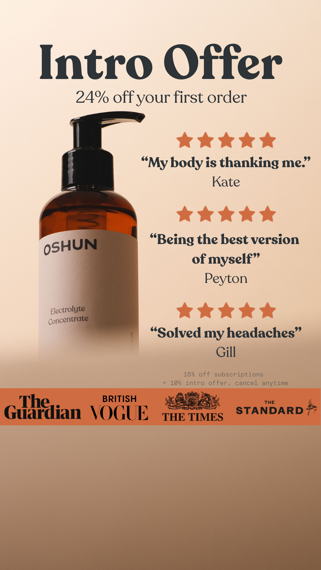
The ad leans into proof-first messaging, positioning OSHUN as a trusted wellness brand featured in major publications. The combination of authentic customer quotes and recognizable media outlets gives the offer real weight while keeping the tone sophisticated.
Tactics to Steal
Lead with validation: Open with five-star reviews and emotional quotes that highlight outcomes, not ingredients.
Use brand associations for instant trust: Featuring media logos (The Guardian, Vogue, The Times) adds authority and elevates perception without needing extra copy.
Keep the tone refined: The muted color palette and elegant serif fonts give a luxury feel that supports premium pricing.
Integrate the offer softly: “24% off your first order” is presented as a reward for joining, not a discount grab.
Guide the eye vertically: The product anchors the layout at the bottom while testimonials and the intro offer guide attention top-down in a natural reading flow.
Example 6: Fyxer AI – Simplicity That Sells Speed
Why I included this example:I love how this ad captures the essence of automation in one effortless sentence. It speaks directly to busy professionals who want to save time and reduce mental load. The message is confident, human, and instantly clear, with no extra words.
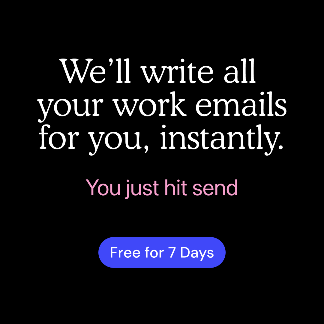
The ad leans into radical simplicity, positioning Fyxer AI as an invisible assistant that just gets things done. The minimal design and tight copy reflect the product’s core promise: write faster, work smarter, and stay focused on what matters.
Tactics to Steal
Lead with clarity: Open with a direct, high-impact statement that describes exactly what the product does (“We’ll write all your work emails for you, instantly”).
Show the end state, not the process: The subline (“You just hit send”) captures the payoff without explaining how it works.
Design for speed: Use a black background, centered text, and minimal color contrast to keep attention on the core message.
Make the CTA frictionless: A bright, low-commitment offer (“Free for 7 Days”) invites users to try without hesitation.
Keep tone confident but calm: The quiet authority in the language and layout builds trust while reinforcing ease and control.
Example 7: IM8 – Myth vs Fact Done Right
Why I included this example: I love how this ad takes a common misconception and flips it into education. It speaks directly to a curious, health-aware audience and delivers clarity in just two lines. The myth-vs-fact format builds authority instantly and makes the science feel simple and accessible.
%20(1).png)
The ad leans into visual contrast and clean structure to tell the story. The dark background makes the product and red accents pop, while the clear hierarchy guides the viewer’s eye from myth to fact to solution. It feels trustworthy, polished, and rooted in expertise.
Tactics to Steal
Lead with contrast: Use a “Myth / Fact” structure to grab attention and reframe a familiar belief in seconds.
Educate, don’t sell: Focus on insight first, then tie it naturally to your product’s benefit.
Use color to separate logic: Red for myth and green for fact instantly signals truth versus misconception.
Anchor with product credibility: The pack design and tagline (“With Cell Rejuvenation Technology 8™”) reinforce scientific legitimacy.
Keep the copy short and confident: One clear fact and one clear claim make the message easy to absorb and remember.
Example 8: Blueland – Calling Out Greenwashing
Why I included this example:
I love how this ad grabs attention by confronting a widespread misconception head-on. It takes a bold stance on sustainability and delivers a clear truth that challenges the viewer. The tone is confident, direct, and educational without being preachy.
%20(1).png)
The ad leans into contrast and minimalism to make its point. The bright blue detergent pod against a clean background forces focus, while the copy delivers a sharp insight in just two lines. It feels bold, transparent, and rooted in purpose, positioning Blueland as a brand that stands for honesty in sustainability.
Tactics to Steal
Lead with confrontation: A provocative headline (“Stop Pretending This Isn’t Plastic”) creates instant curiosity and tension that makes people stop scrolling.
Educate with simplicity: The subline (“Dissolving ≠ Disappearing”) uses a simple visual analogy to explain a complex sustainability issue.
Use visual irony: Show the very problem you’re calling out to drive the message home through contrast.
Keep the design stark: A single object and neutral background ensure the message lands without distraction.
Build authority through truth: Speaking directly and factually builds trust and positions the brand as the credible alternative to “eco” products that mislead.
Example 9: ARMRA – Humor That Hits a Nerve
Why I included this example:
I love how this ad uses humor to talk about a universal but uncomfortable problem. It breaks the tension around gut health by being direct and playful at the same time. The headline feels like a conversation starter, not an ad, and instantly builds curiosity.
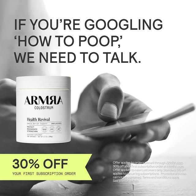
The ad leans into bold simplicity. The monochrome photo background draws focus to the copy, while the bright yellow discount banner anchors attention on the offer. The balance of humor, clarity, and credibility makes it both scroll-stopping and trustworthy.
Tactics to Steal
Lead with humor and honesty: A conversational hook (“If you’re Googling ‘how to poop,’ we need to talk”) uses wit to connect through shared embarrassment.
Reframe the taboo: Turning a private frustration into a public talking point makes the brand feel relatable and confident.
Keep visuals minimal: A simple product shot and a clean background make the copy the hero.
Add contrast with color: The pop of yellow against grayscale imagery makes the offer impossible to miss.
End with clarity: “30% off your first subscription order” is short, specific, and easy to act on.
Example 10: AG1 – The Everyday Upgrade
Why I included this example:
I love how this ad reframes daily spending habits into a health-conscious decision. It uses a simple visual comparison to make a powerful value argument: swapping a $7 coffee for a $5 wellness ritual that actually improves your day. The concept is clear, visual, and instantly relatable.
.png)
The ad leans into contrast and simplicity to drive the message home. The clean split layout creates an immediate “before and after” effect, while the pricing comparison makes the health choice feel logical and rewarding. The green CTA ties perfectly to the brand’s visual identity and reinforces the idea of vitality and renewal.
Tactics to Steal
Lead with comparison: A “Swap That / For This” framing turns a small lifestyle tweak into a smarter, more aspirational choice.
Use price reframing: Highlighting value through cost comparison makes the purchase feel practical, not indulgent.
Keep the visuals clean: Two simple objects on neutral backgrounds ensure the message reads in a single glance.
Make color do the work: The green brand color cues health and draws focus directly to the call-to-action button.
Sell the feeling, not just the function: The line “to support your mental performance” makes the swap feel like self-improvement, not sacrifice.